
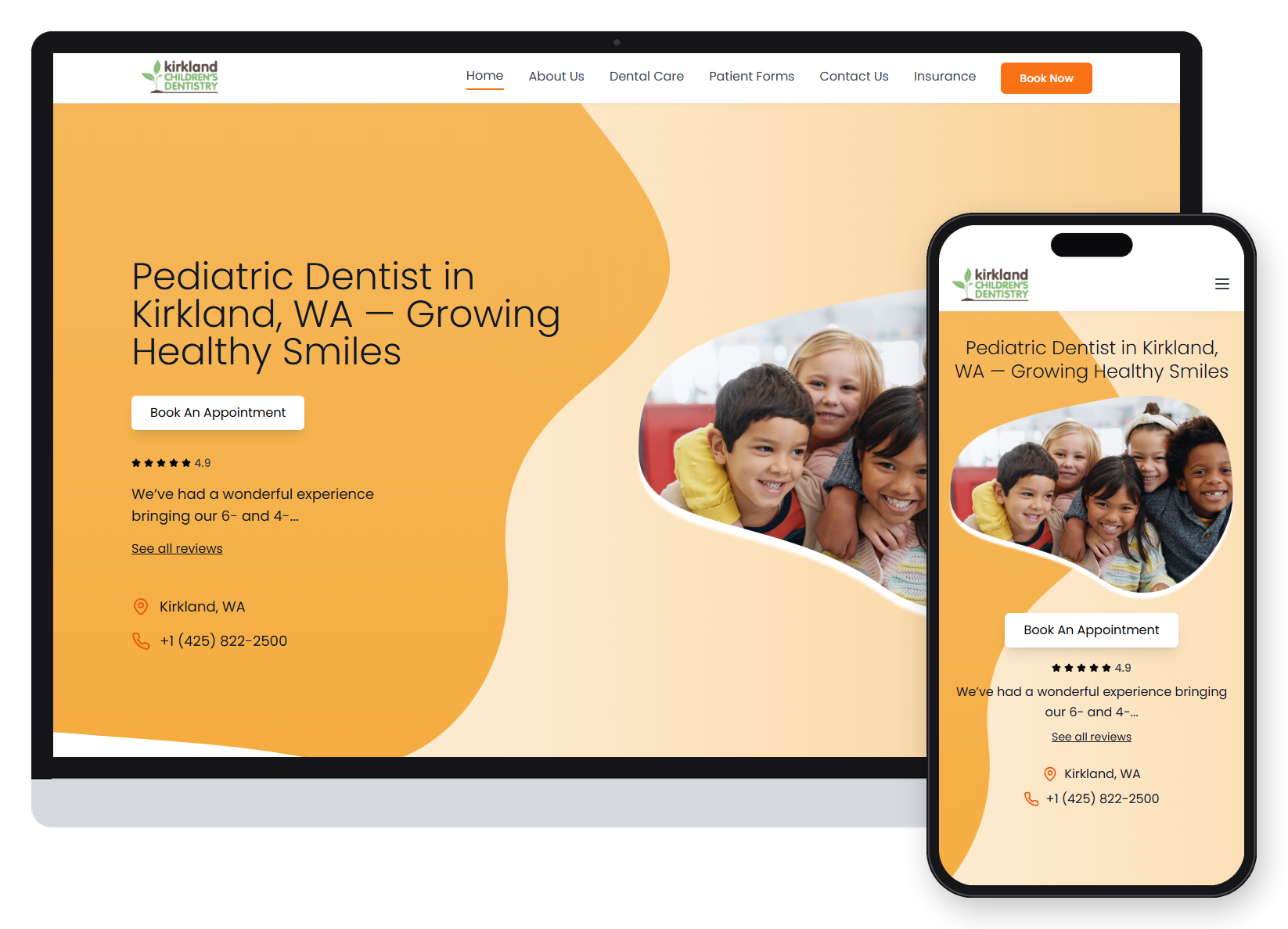

Kirkland Children's Dentistry is a pediatric dental practice in Kirkland, WA. Its website looked friendly, but it didn't tell parents they were on a dentist's site, and booking an appointment was hard to find. I audited the original site, restructured its content, and redesigned it around one primary task: helping families book a visit. After launch I led its local SEO and grew new patients from 11 to 30 a month in four months.
Discover | Problem
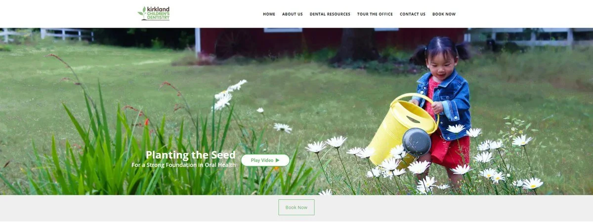
The original homepage opened on a full-width photo of a toddler watering flowers, with the tagline “Planting the Seed”. It was charming, but nothing on the first screen said pediatric dentist. A parent arriving from Google had to scroll or guess.
The most important action, Book Now, was styled like every other navigation link and repeated below the hero as a small outlined button, visually weaker than “Play Video”. Contact details appeared in three different places, and the content blocks didn't look clickable.
Business goal: turn more website visits into booked appointments, and help local families find the practice when they search for a pediatric dentist in Kirkland.
My Role
Activities
Heuristic Evaluation | Content Audit | Information Architecture | Wireframes | High-fidelity Design | Local SEO
Duration
Website redesign: 8 months
SEO: 4 months
Tools
Figma
Google Analytics
Google Business Profile
AI assistants: Claude and Gemini
Role
UX/UI Designer. Research, information architecture, visual design and local SEO, working directly with the practice owners.
User goal: a busy parent wants to confirm this is the right kind of dentist, trust it, and book or call in as few steps as possible.
Discover | Heuristic Evaluation
To find out why the site underperformed, I ran a heuristic evaluation of the original homepage: an expert review that checks an interface against established usability principles. I reviewed the page section by section, top to bottom, the way a parent would scroll it, and noted the heuristic each issue breaks and its severity, so the most critical problems could be fixed first.
Severity scale
HIGH blocks the primary task (booking).
MEDIUM slows users down or causes confusion.
LOW visual polish and consistency.
Framework
I used Nielsen and Molich's 10 usability heuristics as the main framework, and added visual hierarchy, affordances and Gestalt principles (proximity and common region) to assess layout. Method references: Interaction Design Foundation, “Heuristic Evaluation” and “Gestalt Principles”.
The evaluation is split into three parts that follow the page from top to bottom.
Before | Original Homepage
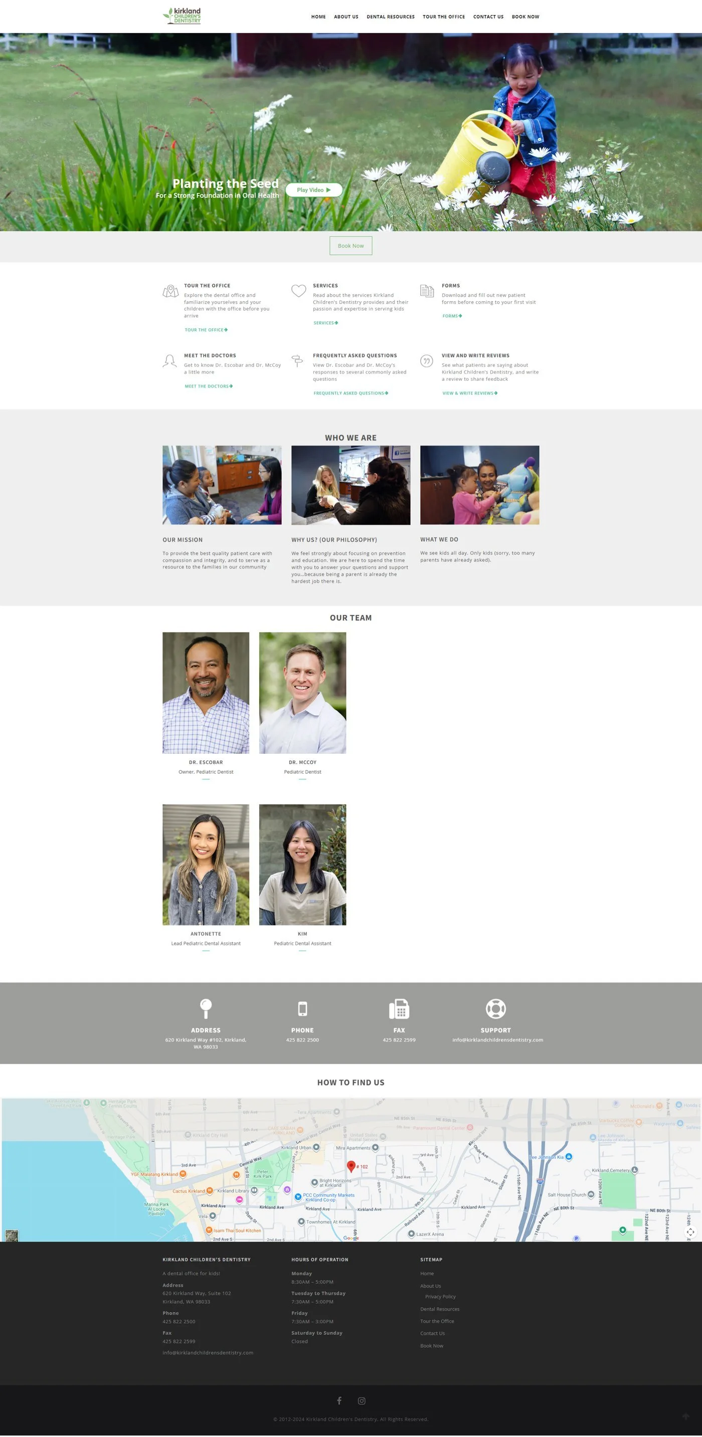
The original homepage, captured before the redesign. I reviewed it section by section, from the navigation bar to the footer, the way a parent would scroll it.
Heuristic Evaluation 1 | Navigation & Hero
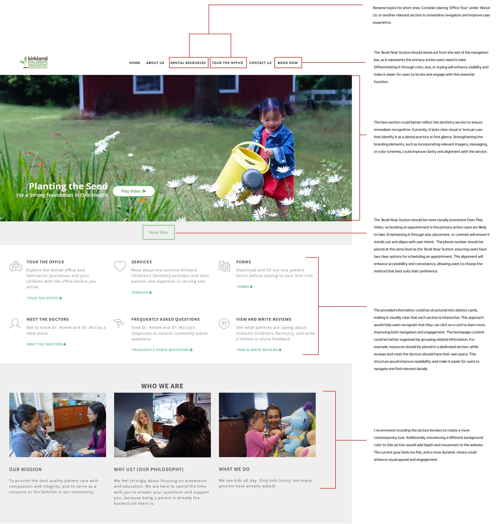
MEDIUM · 1. Long navigation labels. “Dental Resources” and “Tour the Office” are long, and the office tour is supporting content promoted to the main menu. Heuristic: aesthetic and minimalist design, information architecture.
HIGH · 2. Book Now blends into the menu. The primary call to action has the same style as every other link. Heuristic: visual hierarchy, consistency and standards.
HIGH · 3. The hero doesn’t say “dentist”. A garden scene and “Planting the Seed” give no cue that this is a dental practice. Heuristic: match between system and the real world.
HIGH · 4. Play Video outranks Book Now. Booking is a small outlined button below the hero, and the phone number isn’t offered as a second way to book. Heuristic: visual hierarchy, flexibility and efficiency of use.
MEDIUM · 5. Links don’t look clickable. Six text blocks with small links lack affordance, and resources, doctors, FAQs and reviews are mixed in one grid. Heuristic: affordances and signifiers, Gestalt proximity and common region.
LOW · 6. Flat grey “Who We Are”. Square photos on a flat grey band feel dated and give the page no visual rhythm. Heuristic: aesthetic and minimalist design.
Heuristic Evaluation 2 | Team Section
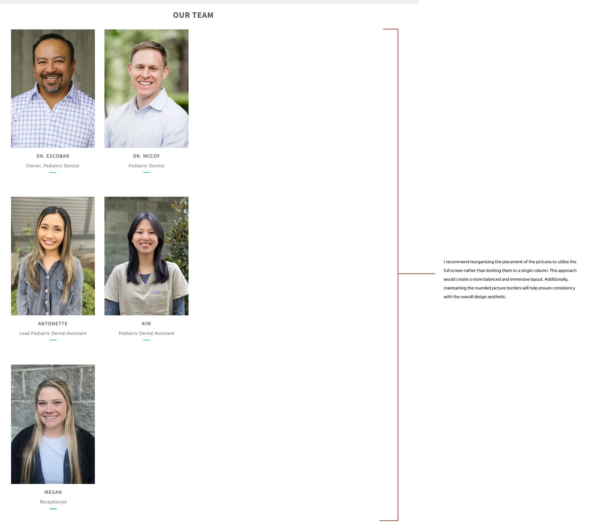
MEDIUM · 7. Team photos squeezed into one column. Staff portraits stack in a narrow column on the left, leaving most of the screen empty and making the section very long to scroll. Heuristic: layout grid and white space, aesthetic and minimalist design.
Heuristic Evaluation 3 | Contact & Footer
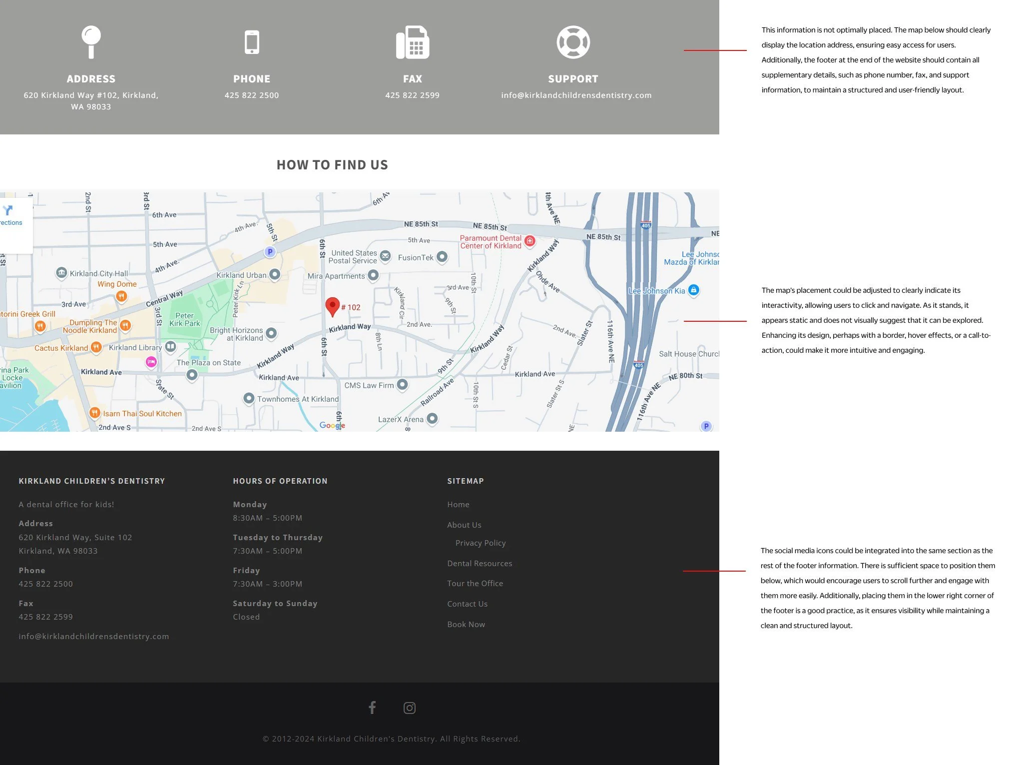
MEDIUM · 8. Contact details repeated out of place. A grey strip repeats the address, phone, fax and email that also appear in the footer, and the address is separated from the map it belongs to. Heuristic: consistency and standards, aesthetic and minimalist design.
LOW · 9. The map looks static. Nothing signals that the map can be clicked for directions. Heuristic: affordances and signifiers.
LOW · 10. Social icons isolated. Facebook and Instagram sit alone in a separate bar under the footer, away from the rest of the contact information. Heuristic: consistency and standards, Jakob’s law.
Define
I grouped the ten findings into four design goals. They guided every decision in the redesign and answer one question: how might we help a busy parent confirm this is the right dentist for their child and book a visit in under a minute?
HIGH · Booking is always one click away. Book Now is the strongest element in the header and the hero, with the phone number beside it. (Findings 2, 4)
HIGH · Recognizable in five seconds. Parents should know immediately that this is a pediatric dentist in Kirkland. (Findings 3, 6)
MEDIUM · Scannable, grouped content. Content is chunked into clear groups with obvious, clickable cards. (Findings 1, 5, 7)
MEDIUM · One home for each piece of information. No duplicate contact blocks, and a footer that follows familiar conventions. (Findings 8, 9, 10)
Design
HIGH · Primary call to action (finding 2). Book Now is a solid orange button, the only filled element in the header.
HIGH · Hero (finding 3). New headline, “Pediatric Dentist in Kirkland, WA — Growing Healthy Smiles”, with a photo of smiling children. The headline also carries the local search keyword.
HIGH · Booking options (finding 4). “Book An Appointment” is the hero’s primary button, with the phone number and location right below it, plus the Google rating as social proof.
MEDIUM · Navigation (finding 1). Short, task-based labels: Home, About Us, Dental Care, Patient Forms, Contact Us, Insurance. Office Tour moved into the Resources cards.
MEDIUM · Content groups (finding 5). Separate sections for Resources (three cards with buttons), Meet Our Team, Our Location, Hear From Our Patients and Parenting Resources.
MEDIUM · Team (finding 7). Doctors shown side by side in a balanced two-column layout.
MEDIUM · Contact and footer (findings 8, 9, 10). The address sits with the map in Our Location; phone, fax, email and social icons live once, in the footer.
LOW · Visual language (finding 6). A warm orange and green palette taken from the logo, with rounded, organic image shapes.
Every change maps back to a finding from the heuristic evaluation. I fixed them in order of severity: HIGH first, then MEDIUM, then LOW.
Deliver | The New Homepage
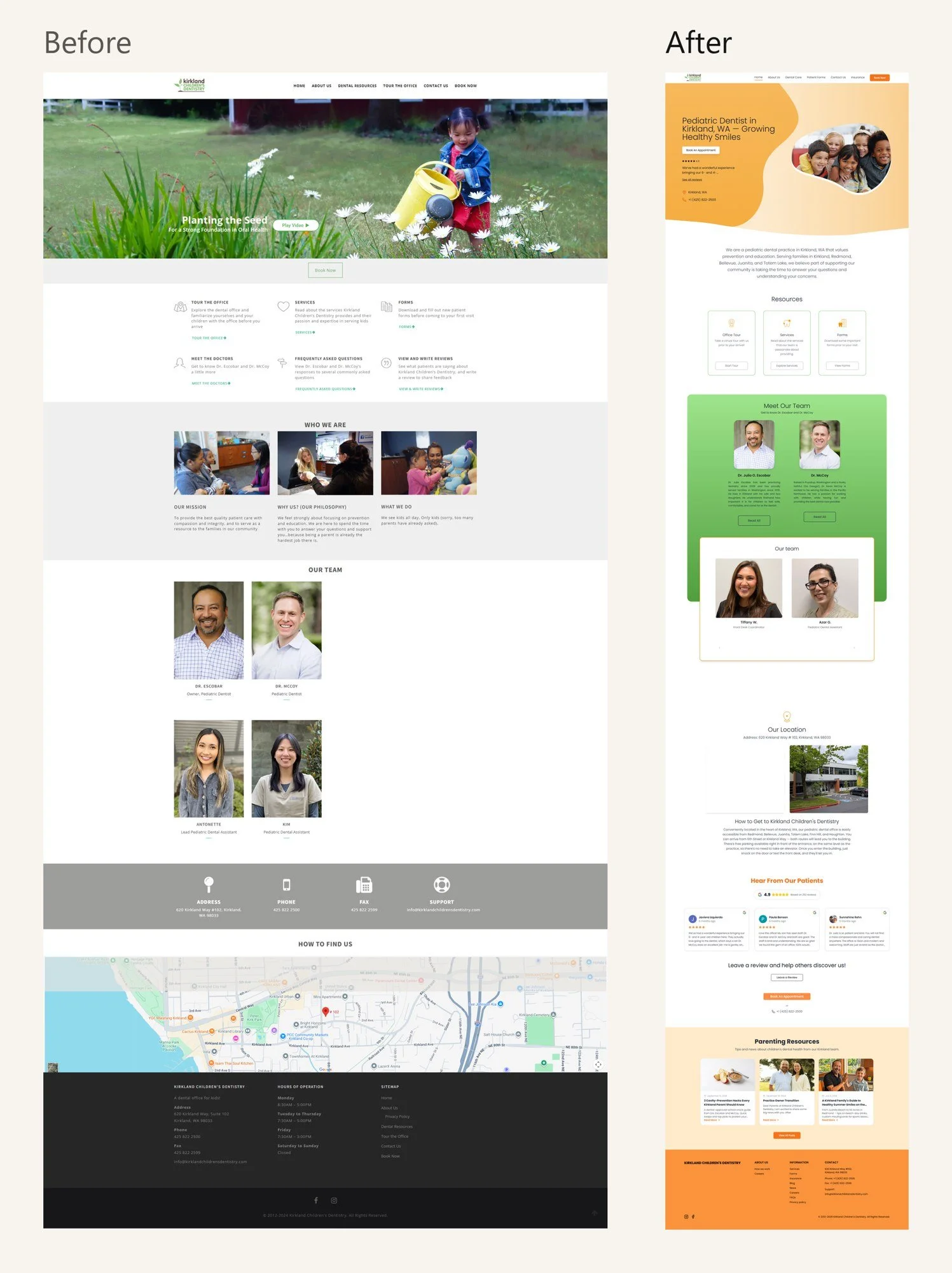
The redesigned site is live at kirklandchildrensdentistry.com. The homepage now follows a parent's decision path: confirm this is a pediatric dentist, see the booking options, check trust signals, then explore resources, the team and the location. Booking is reachable from the header and the hero on every screen size, and real Google reviews (4.9 stars) appear on the first screen.
Results
From 11 to 30 new patients a month (+173%). The main business goal, met two months early.
+86% direction requests on Google Maps. From 113 in May to 210 in August 2026.
+33% Google Business Profile interactions. Calls, directions and website clicks grew from 312 in May to 416 in August 2026.
Top positions in Google search without paid ads. The profile also shows up for non-branded searches such as “pediatric dentist”.
Measure | Local SEO. After delivering the website, the practice put me in charge of its SEO with three success metrics and a six-month deadline. We met all three goals in four months. I worked on it continuously, using Gemini and Claude as AI assistants and optimizing the practice's Google Business Profile. Source for the Google metrics: Google Business Profile Performance, May to August 2026.
Key takeaways
Rating severity helped prioritize. Fixing the booking path came first because it affects the business directly.
A heuristic evaluation is a fast, low-cost way to get a client on board. Annotated screenshots made the problems visible to the practice owners without a long report.